
eToro has just made investing in ETFs more accessible. We are excited to announce three new data resources that are now on all ETF pages on the platform. These data points give you a load of valuable information and help simplify the world of ETFs.
Let’s take a look at the three data insights and how they help you make well-informed decisions.
Three data insights explained
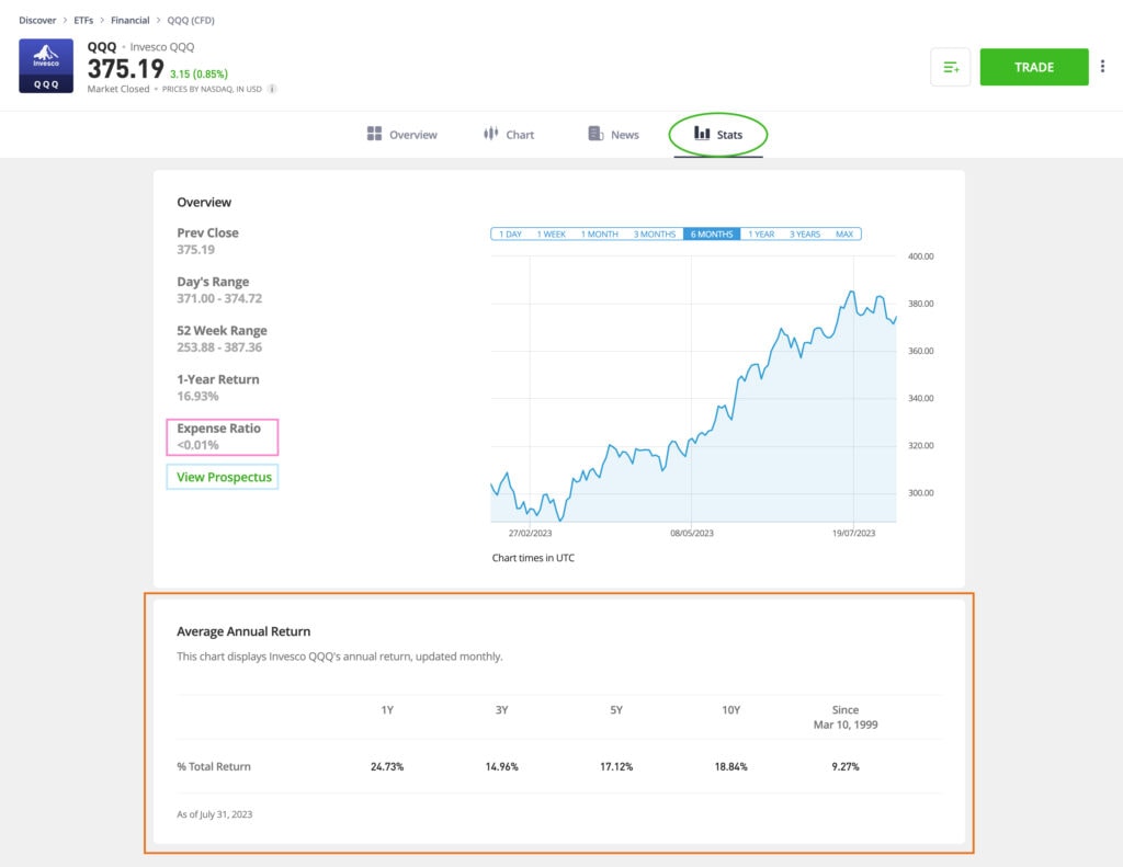
The three new data insights are: Expense Ratio, Prospectus Link and Annualized Return Chart. These three points are visible on the Stats tab of any ETF. Expense Ratio is in the yellow square. Prospectus Link is in the square below. And you can see the Annualized Return Chart in the red square.
*For illustration purposes only
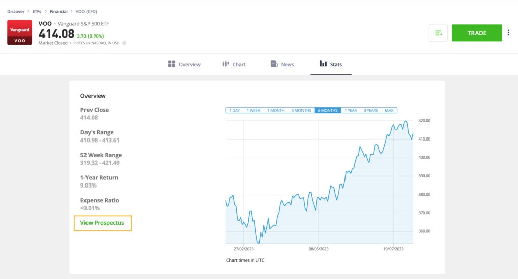
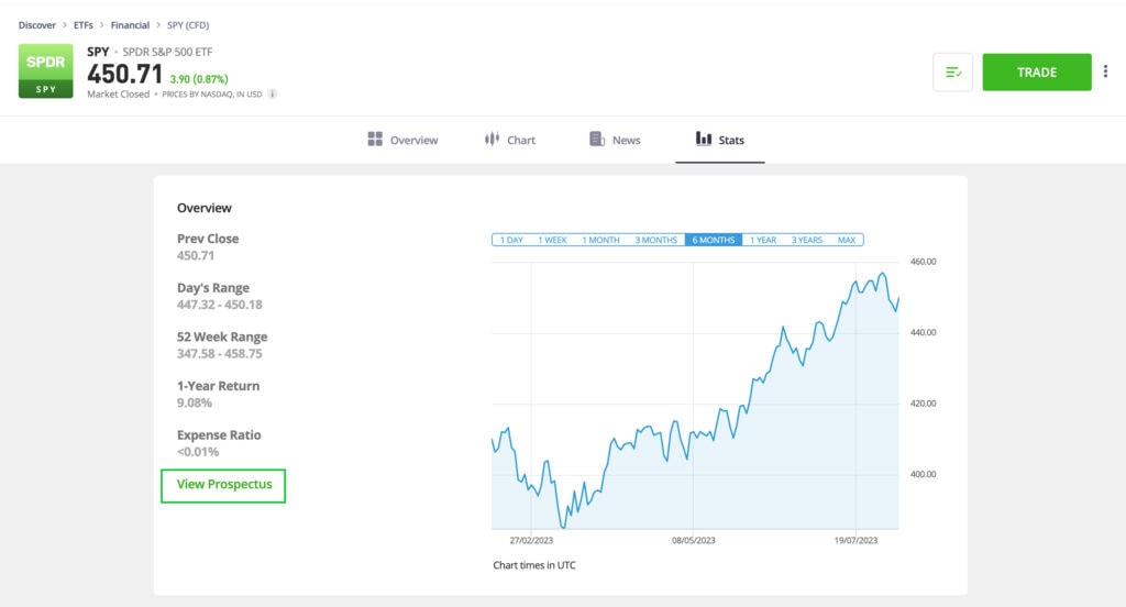
Expense Ratio
It’s basically the yearly cost you pay for owning a mutual fund or ETF. It is shown as a percentage of the fund’s assets, and it’s really handy for investors like us. You can see it in the screenshot below.
Why is this useful for you?
- It helps you figure out how much the fund is going to cost you and compare different options easily.
- Understand how fees affect your returns, which is helpful when making investment decisions.
- Lower expense ratios usually mean higher net returns in the long run.
*For illustration purposes only
Prospectus Link
An ETF prospectus is a helpful document provided by the company offering the ETF (Exchange-Traded Fund). It contains important information that potential investors should know. You can see on the screenshot below where the Prospectus Link appears on the Stats page.
*For illustration purposes only
If you click on the link, you’ll find details about the investment objectives, strategies, risks, expenses, and other relevant information on the ETF. It’s prudent for investors to review the prospectus carefully. By doing so, you can understand the ETF’s investment approach, the risks involved, and the costs associated with it. This knowledge will empower you to make well-informed investment decisions.
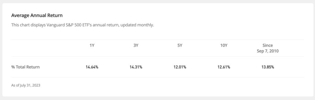
Annualized Return Chart
An ETF annualized return table displays the historical annual returns of an ETF over different time periods. It helps investors:
- Evaluate the fund’s past performance
- Compare it with benchmarks or peers
- Identify trends
- Set investment expectations
It’s a valuable tool for assessing ETF performance and guiding your investment choices.
In the screenshot below, you can see — in the highlighted square — the annual percentage returns over one-, three-, five- and ten-year periods, as well as the percentage of return since the ETF’s inception.
*For illustration purposes only
Our number one priority
With these new data insights, we are confident that investing in ETFs is now more accessible than ever on the eToro platform. With more than 300 ETFs on the eToro platform, you can use these new insights to find the ETF that meets your investment goals. Whether it’s an ETF tracking a specific index or industry, the exciting world of ETFs is now one step closer for eToro users.
eToro is a multi-asset investment platform. The value of your investments may go up or down. Your capital is at risk.
This communication is for information and education purposes only and should not be taken as investment advice, a personal recommendation, or an offer of, or solicitation to buy or sell, any financial instruments. This material has been prepared without taking into account any particular recipient’s investment objectives or financial situation, and has not been prepared in accordance with the legal and regulatory requirements to promote independent research. Any references to past or future performance of a financial instrument, index or a packaged investment product are not, and should not be taken as, a reliable indicator of future results. eToro makes no representation and assumes no liability as to the accuracy or completeness of the content of this publication.