Hi everyone, I wanted to take the time to talk about an extremely important feature we implemented into the OpenBook just recently. You can find it in the Stats tab of each trader, it’s the introduction of the Realized Equity and Total Equity charts.
*TIP – you can press either line names to show only one of them or both.
I would like to briefly explain each. The green line, Realized Equity, represents a history of all CLOSED positions of the trader. This is what we’ve shown in the past. We’ve now introduced the blue line, Total Equity, which represents the history of all CLOSED positions combined with the OPENED positions in the same time period.
What does this line allow us to see? It shows us the open positions handling of the trader. Let’s review several scenarios.
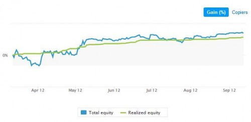
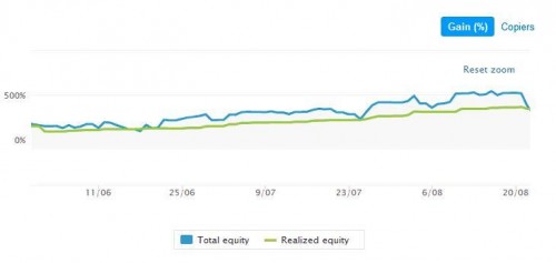
Total Equity higher than Realized Equity (Blue above Green)
*Tip – you can zoom into periods on the charts by simply clicking and keep pressing the mouse in an area you want to see and then move the mouse over the period you want to zoom into. A Reset Zoom button will be displayed to return to normal zoom settings.
This shows us that the P&L of the positions during the time they are open is actually higher than what is being closed. We can compare this scenario to a winning position that has been stopped on a winning Stop Loss or that the trader closed it after the trade has reached its peak and started to go down again. It indicates the trader also holds profitable trades for a long time and closes them under their peak.
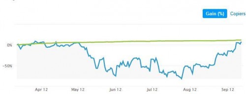
Realized Equity higher than Total Equity (Green above Blue)
This shows us that the P&L of the positions during the time they are open is actually lower than what is being closed. It means that the open positions at the time were lower than what was closed. It might suggest the trader carries losing positions throughout the time.
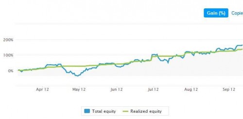
Realized Equity is close to Total Equity (Green above Blue)
This situation shows us a very tight Open and Close equity handling. The open positions handling is very close to the closing strategy. It shows a tight trading regiment that does not carry positions over a long period. It can also show a situation in which not many positions are opened at the same time which would explain the close relation of both Open and Closed equities.
In general, the larger the distance between the two lines, the bigger the difference between Open and Closed equities. It shows us for how long positions are held in loss (Realized over Total, Blue under Green) or profit (Total over Realized, Blue over Green).
This feature can give us an image of the trading style of the trader we are looking at. Is he consistent in his open positions handling, is he carrying positions for long periods, how is he planning his trading etc.
It’s an excellent feature, requested by members of the community, and provided to you by eToro. Keep up the good work of sending us feedbacks, through the different eToro Team users and community agents, and you’ll see plenty more features that you requested coming your way!


 Written by Ira More


