


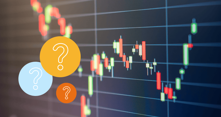
Candlestick charts and patterns are helpful tools that investors can use to help determine an asset’s potential based on past performance. Here’s how they may help you invest.
From new investors to established traders, everyone has their own way of researching and choosing stocks and other instruments as part of their long-term financial strategy. Candlestick charts and patterns are another way that investors can use data to support their decision-making in the markets.
Understanding candlestick patterns isn’t overly challenging, however, there are several elements that make up these charts. So, we’ve put together this helpful guide to explain all of the essentials.
Read on to find out everything you need to know about candlestick charts and patterns to help your decision-making when investing in shares.
What is a candlestick pattern?
Candlestick charts are a type of financial data stream used to predict the potential price movement of securities, derivatives or currencies based on past patterns. Essentially, investors use them as a guide to understanding where the price will potentially go — higher or lower — according to its recent movements.
Candlestick charts are much more detailed than standard price charts, which only indicate the price of an asset, for example, at the close of the market. Each candlestick shows in graphical form four key data points for each time interval: the high, low, opening and closing prices.
The wide “body” of the candlestick represents the opening and closing price points, whereas the thin “wicks”(or upper and lower shadows) show the high and low price points throughout that day.
Candlestick charts can also differ in appearance depending on an asset’s performance. If the body is filled in, then the closing price was lower than the opening price. If the body is empty, the opening price was higher than at close.
Depending on where you’re trading, a ”down” candle may be coloured black or red, whereas an “up” candle may be green or white.
Are candlestick patterns reliable?
Many investors look for specific candlestick patterns to indicate whether there’ll be a rise or fall in price in the near term. Because of the use of technology to analyse performance and make near-instantaneous trading decisions, some candlestick patterns are less useful than others.
That being said, there are still reliable candlestick patterns to be found, so long as you recognise that they are time-sensitive and their potential for predicting higher and lower prices may decrease after just a day or two. Different patterns will be favoured by different types of investors, depending on what type of strategy they are applying
For example, the Two Black Gapping candlestick pattern is a continuation pattern attractive to bearish investors, as it may indicate a continual decline and widescale downtrend. On the other hand, the Three Line Strike is a bullish candlestick pattern that indicates the end of a downtrend right before a reversal to sustained higher prices.
Whether or not candlestick patterns are valuable data sources remains a contentious topic among investors, especially in terms of their reliability in the digital age when trading decisions are made extremely quickly.
However, some patterns do provide unusually accurate predictions about how an asset may perform over the short term, which can be invaluable for investors who love using data to inform their trading strategy.
How to read a candlestick chart on eToro
Reading a candlestick chart is easier than you think. Once you understand how to analyse the asset’s previous price movements, you’ll be able to interpret trends from just a few “bars” or “days’” worth of data.
If you’re just starting out with candlestick charts, make sure you focus on the three key features:
- Body: This covers the range of open to close, with both the opening price and closing price at the top and bottom of the body.
- Wick: Also known as the shadow, this indicates the intraday high and low prices.
- Colour: This reveals the direction the asset is moving in, with a green or white body meaning a price increase, and red or black meaning a price decrease.
Tip: Candlestick patterns offer a useful and simple visual interpretation of market conditions but are best used in conjunction with other indicators.

How many candlestick patterns are there?
Over the years, numerous candlestick patterns have been identified, with varying degrees of accuracy and, therefore, popularity among traders. These generally fit into one of three types of patterns: bullish, bearish and continuation candlestick patterns.
While there is no official number of patterns, experts agree that there are anywhere from a handful up to several dozen different candlestick patterns that investors may use in their day-to-day trading strategies, some of which we’ll investigate below.
Tip: While not always a reliable tool, candlestick patterns can help investors make a decision about when to enter or exit a trade.
Common candlestick patterns for investors
There are several candlestick patterns that you should learn about in order to support your long-term investing strategy. Here are some of the most common candlestick patterns and what they mean:
Bullish candlestick pattern
Bullish is a category of candlestick patterns that indicates the price is more likely to rise than fall. Green (or white) candles are bullish and represent potential strength in the asset.
There are a number of bullish candlestick patterns including:
- Bullish Engulfing
- Bullish Harami
- Bullish Rising Three
- Bullish Counterattack
Hammer candlestick pattern
Hammer is a single candlestick pattern and generally appears at the end of a downtrend, often signalling an uptick in the price in the near term. The Hammer candlestick is instantly recognisable as the body is small with virtually no upper wick and a long (at least double the length of the body) lower wick.
Bearish candlestick pattern
Bearish in contrast to bullish, is a category of candlestick patterns that indicates the price is more likely to fall than rise. Red (or black) candles are bearish and represent potential weakness in the asset.
There are a number of bearish candlestick patterns including:
- Bearish Engulfing
- Bearish Harami
- Bearish Falling Three
- Bearish Counterattack
Doji
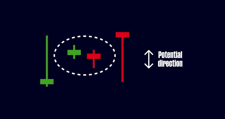
Doji is a continuation candlestick pattern that is similar to the Hammer pattern. In contrast, Doji represents indecision in the market, with the body extremely small due to the open and close prices being almost equal, with huge upper and lower wicks.
Tip: Doji occurs when bearish and bullish investors are fighting to control an asset’s price, both without success.
Shooting Star candlestick pattern
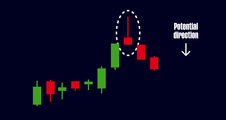
The Shooting Star candlestick pattern forms at the end of an uptrend and usually foretells a bearish reversal — or price drop — in the near term. The body is small and there is no or very little lower wick, with a long upper wick at least double the length of the body.
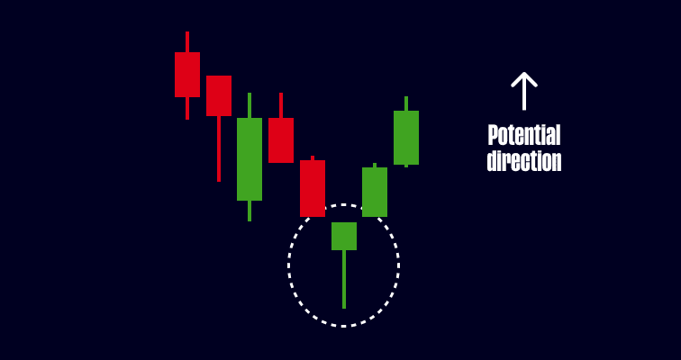
Morning Star candlestick pattern
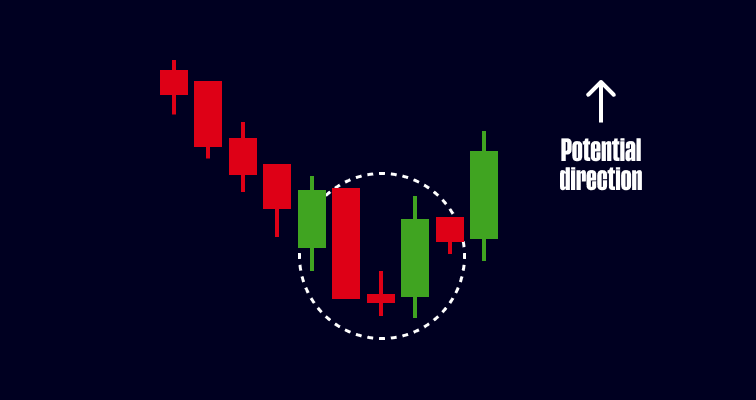
The Morning Star pattern consists of three candlesticks formed after a downtrend, typically indicating a bullish reversal. The first of the three candles is Bearish, the second is a Doji (explained above), while the third candle is Bullish.
Spinning Top candlestick pattern
Similar to the Doji candlestick pattern, the Spinning Top candlestick generally shows market indecision. The only real difference between the two is that the Spinning Top’s body is larger than the Doji’s body.

How can candlestick patterns help your investing?
Ultimately, candlestick charts are tools to help you to apply technical analysis to an asset’s potential performance. They should be used in conjunction with other trading analyses to help form a more solid foundation for your investment choices.
The benefits of spotting patterns in the candlesticks will differ from investor to investor, but they may include the ability to better forecast an asset’s price, as well as having a greater understanding of how past performance may indicate future movements.
The good news is that you can leverage the insights of candlestick charts when investing on eToro. These helpful charts and patterns are available for all stocks, ETFs, currencies, cryptoassets, indices and commodities found on eToro.
Looking at the charts produced for a variety of different investment types on eToro can be incredibly helpful for your long-term investment journey, as they’ll provide good practice in spotting the different patterns and market movements in real life.
While not necessarily a common support tool for all investors, there is great value to be found in candlestick charts and even some reliable insights when you start to recognise clear candlestick patterns. After all, any data that helps inform your decision-making when trading can be extremely beneficial over the long term.
Visit the eToro Academy to learn more about trading.
Your capital is at risk.
FAQs
- What are other trading strategies?
-
Identifying candlestick patterns is part of what’s known as technical analysis. Some investors use fundamental analysis as another trading strategy to identify stocks for investment. They may consider qualitative variables, such as the company’s business strategy, governance and target markets. Financial ratios and financial statement analysis are examples of quantitative variables in fundamental analysis. These elements are indicators of the company’s performance.
- How accurate are candlestick patterns?
-
Although candlestick patterns can be useful tools for investors, they may not be the most accurate data sources. Patterns tend to be time-sensitive, and the information they present may decrease in accuracy in just a few days. If you’re thinking about using candlestick patterns as part of your technical analysis, it’s always good to use them in conjunction with other indicators.
- Where can I find candlestick charts?
-
All stocks, currencies, cryptoassets and commodities listed on eToro are displayed with an accompanying candlestick chart. To access these charts, simply head to an individual asset page and click on the “Chart” tab.
This information is for educational purposes only and should not be taken as investment advice, personal recommendation, or an offer of, or solicitation to, buy or sell any financial instruments.
This material has been prepared without regard to any particular investment objectives or financial situation and has not been prepared in accordance with the legal and regulatory requirements to promote independent research. Not all of the financial instruments and services referred to are offered by eToro and any references to past performance of a financial instrument, index, or a packaged investment product are not, and should not be taken as, a reliable indicator of future results.
eToro makes no representation and assumes no liability as to the accuracy or completeness of the content of this guide. Make sure you understand the risks involved in trading before committing any capital. Never risk more than you are prepared to lose.